Design Systems
Cooler than you might think
Cooler than you might think
UX Design Intern
May - Aug
2023
UX Designers
UX Writer
Figma
Slack
Quip
Design Systems
Visual Design
Documentation
Accessibility
During my internship at Amazon, I crafted and launched documentation for an internal design system on the Advertiser Experience Team.
This included the addition of 5 components from another team within the organization. Each component included the Figma design and a documentation page outlining its use, accessibility, and an anatomy diagram.
My final deliverable also included a long-term plan along with immediate next steps for the design system.
When I was offered an internship at Amazon, I was so excited. But when I was assigned to the advertising team I was slightly less excited. I knew nothing about advertising and was hoping that my project wouldn’t be too boring.
Fast forward to my first week and I find out that my intern project is focusing on the design system. I had never worked on a design system before, so I knew this was going to be interesting.
Since I didn’t know much going in, I had a lot of work to do to understand the product space. This meant looking into who the users were, what my team was, and why this design system even exists in the first place.

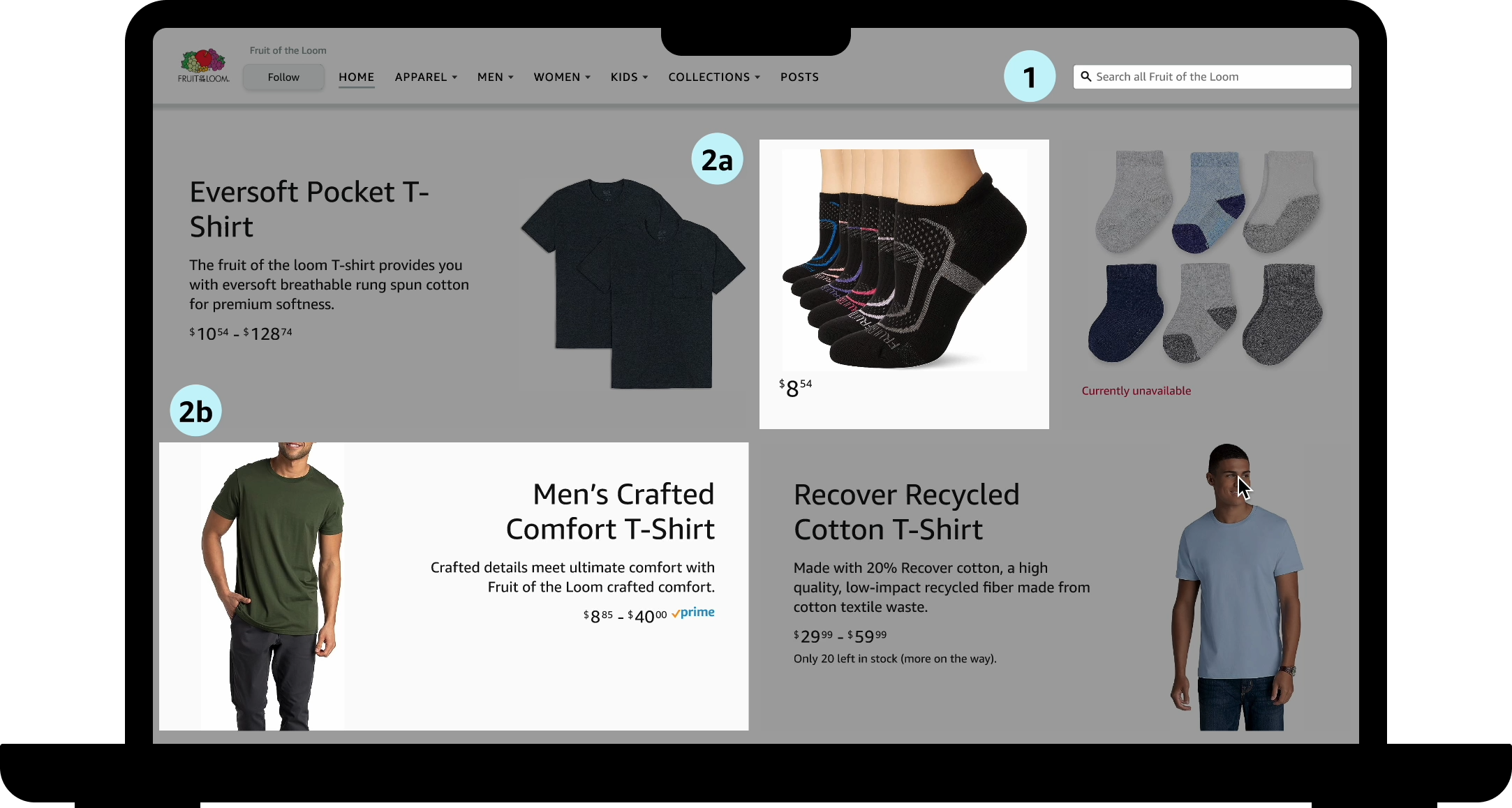
The design system is for consumer facing advertising experiences, which in simpler terms means that it’s the ads that regular shoppers see when they’re on amazon. This spans across all the different pages and includes both internal and external ads. Due to time constraints the first iteration of this design system only included 5 base components.
Keeping them in mind, I needed to learn more about what the design system was missing. To do that I created a survey that all 30 members of the team took. There were 3 main findings from this.


These issues meant that the design system wasn’t being used to its full potential, which in turn meant that some of the hard work that went into it was going to waste.


So I went to the drawing board and tried to figure out what components made sense to work on. My internship was only a summer so it would be impossible to design every component, but I sure could do at least 5.


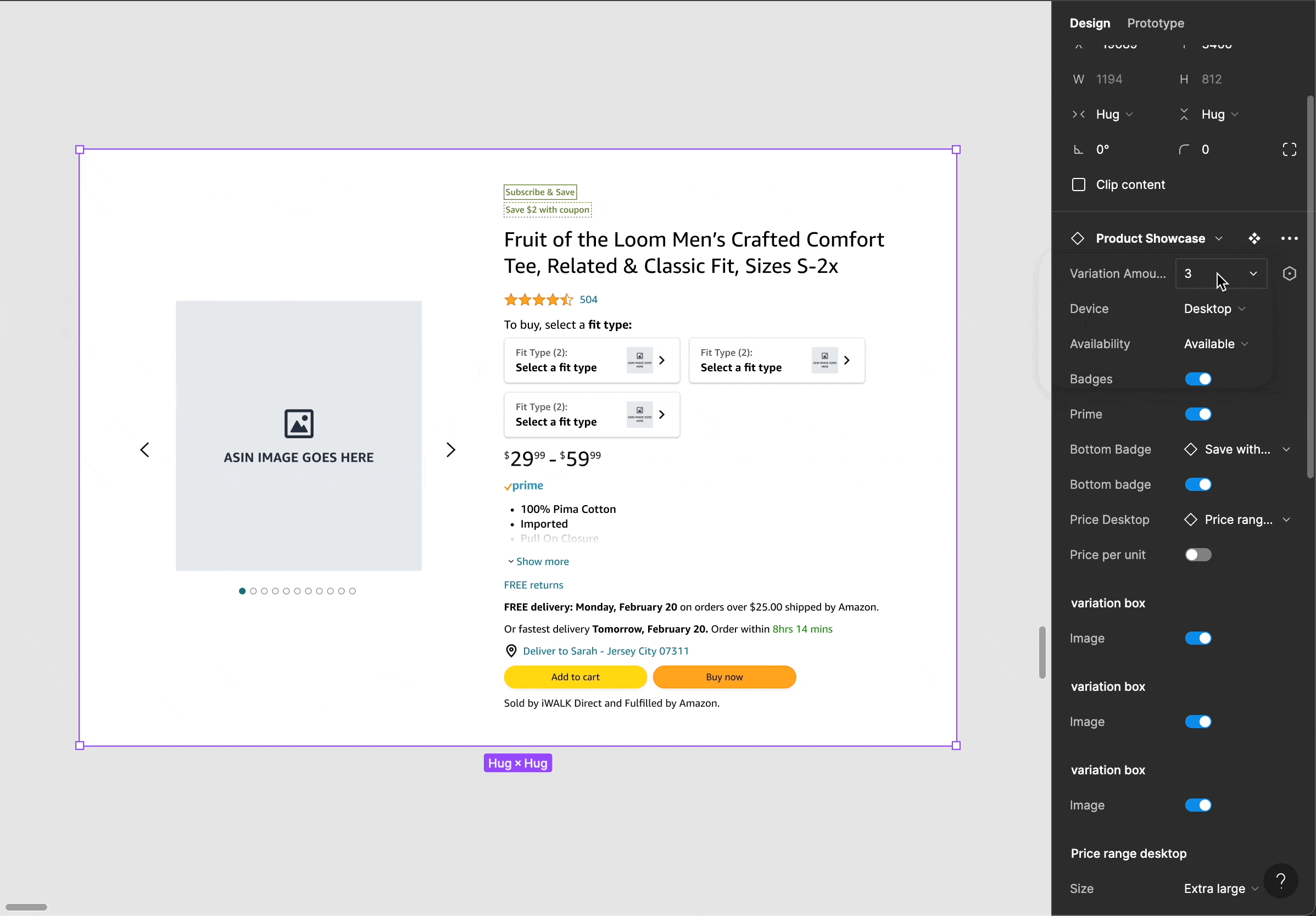
So, in order of importance I decided on the following 5 components Product Tile, Product Showcase, Product Collection View*, Shoppable Image*, and Search Bar. Each has its own figma page along with a wiki page. I also edited the layout to be more intuitive and comprehensive.
This is what the desktop version of the figma component for the product showcase ended up looking like. It has many booleans, variants, and instance swaps.

Thank you to the Amazon Ads team for having me. Special thank you to my mentor, manager, and onboarding buddy.
I am proud of myself. The components started being used before I even finished them, so I feel fulfilled in my journey. Designers found my work helpful and I was able to fix the issues about layout and confusion through my redesign.
Most importantly, I also have a newfound appreciation for advertising, design systems, and components.