.gif)
User research
Make my life easier
Make my life easier
Product Designer
Feb - Dec 2022
Product Manager (1)
Co-Designer (1)
iOS Developer (2)
Android Developer (2)
Marketer (2)
Figma
Notion
User Research
Visual Design
Competitive Analysis
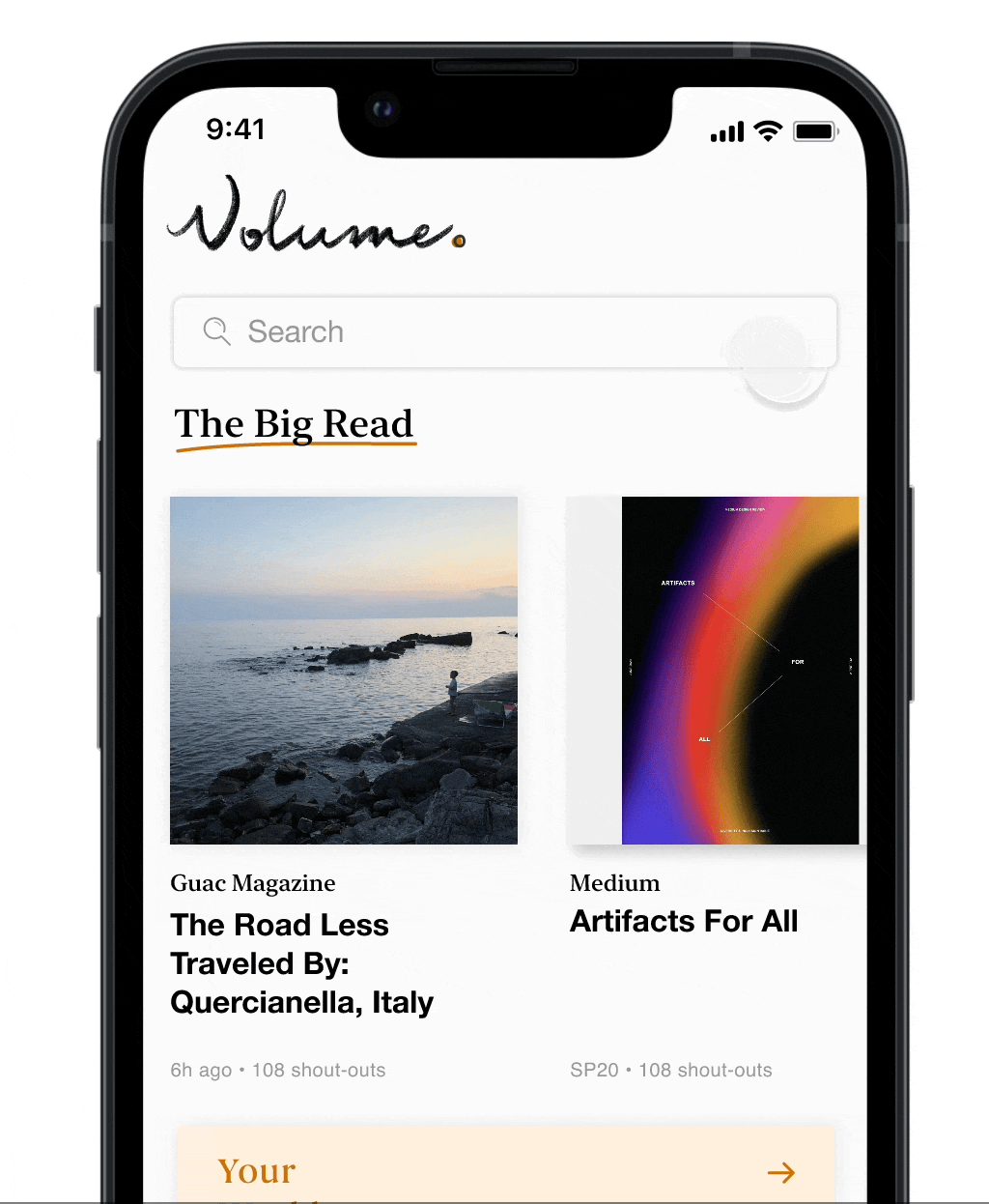
Volume is a mobile app created by Cornell AppDev that aims to connect students with student publications by being a central hub for student magazines, articles, and blogs. It allows for student voices to be heard and the team works closely with student publications to make this happen. As a Product designer, I researched and designed publication analytics from the ground up and crafted a search feature for >150 users.
I joined the team a year after the app had launched, so there was already an existing design system along with a working and shipped MVP. Therefore my work consisted of making improvements to the app that aligned with its current goals.


The most natural way to build relationships with people is to talk to them. After all, these publications aren’t huge corporations, they’re student groups. So I worked with the marketing team to arrange user interviews with publications we already have on Volume along with ones that we don’t.

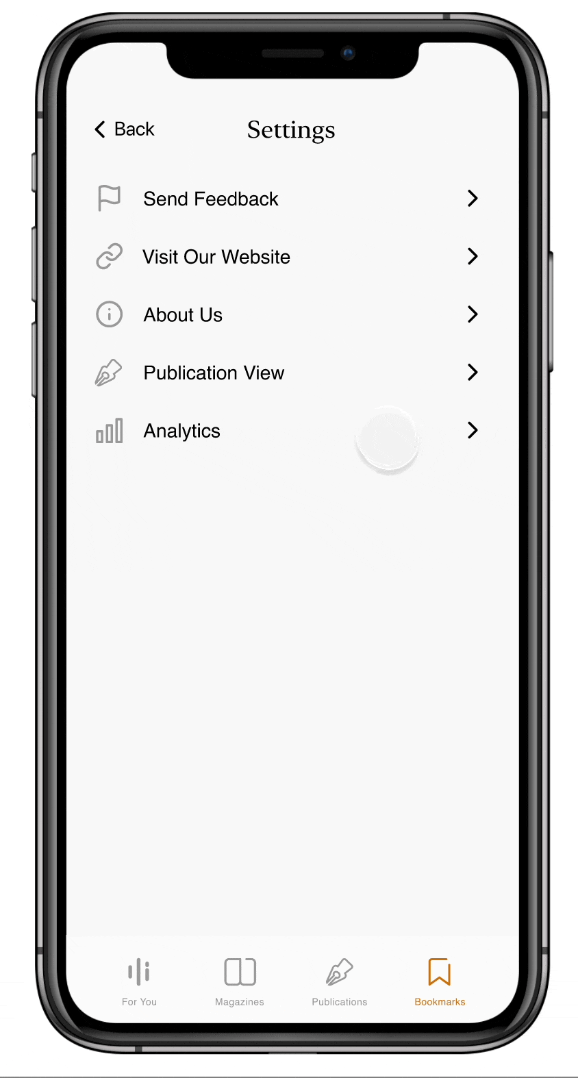
Publications are interested in seeing stats for their overall publication along with magazines in isolation. Therefore two pages of analytics were needed, one for individual articles and one for overall stats.
With the insights in mind, I started sketching designs.
.png)
Initial Sketches
I then translated these rough ideas into Figma and made various iterations.
.png)
Initial Wireframes
Looking back at what users were looking for, it is clear that they need a way to see both a breakdown of general content and insights for specific articles.
Combining both A and B was the clearest way to achieve that goal and allowed the designs to be consistent with the home page table view styled display of articles.

Overall Analytics
With that finalized, the next step was to decide what article insights would look like.
Jumping into the wireframes I made, I needed to remember the insights that mattered most to the publications as they are the primary user here.
.png)
Initial Wireframes
Therefore, to display interactions and engagement like publications requested, there needed to be an emphasis on the three primary actions a user can take:
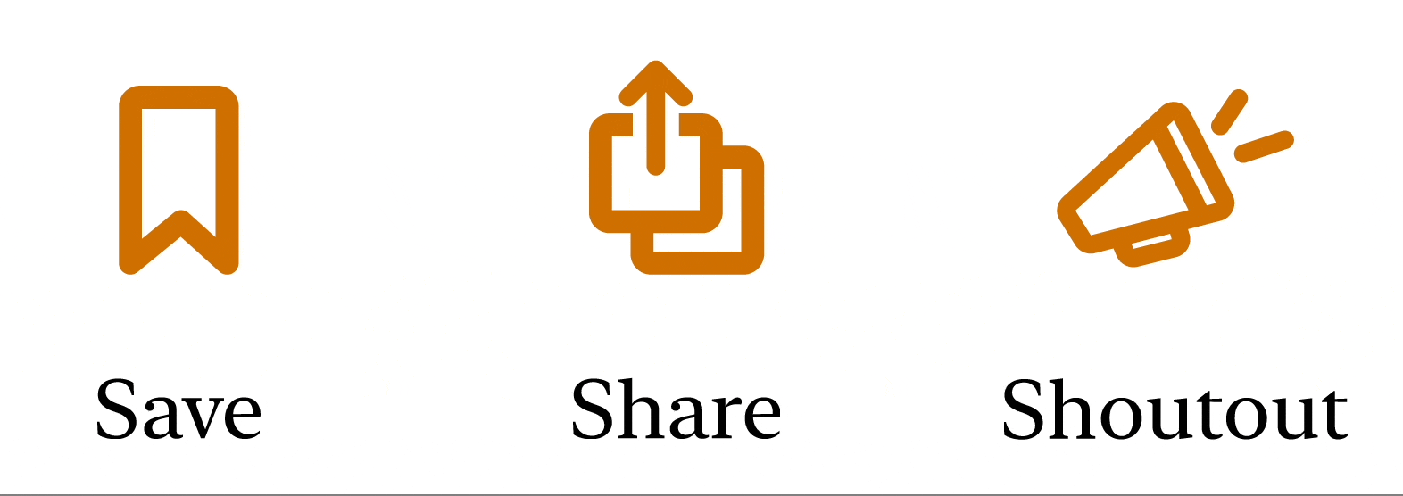
Primary app actions
However, it also needed to be easily digestible. For these reasons designs A-C were not continued.
Although E was a strong contender with the ability to switch between articles on the same page, it was deemed confusing for that very reason. (in user testing)
This made D the standout option and final choice.
Overall Analytics
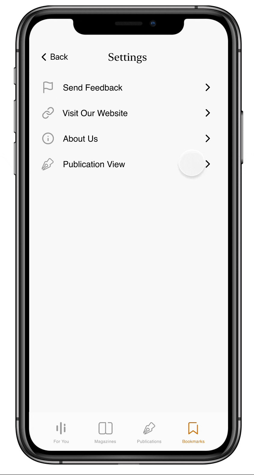
Settings to enter analytics
Seeing analytics for a publication
Magazine were just integrated into the app when I joined, however we were missing screens for edge cases, so that was my task for this project.
This also included flows like integrating magazines into the home page and creating the table of contents for the reader.
These were the starting sketches that my Co-Designer made and that we jointly decided to pursue.
.png)
From the magazine reader, users would be able to click the table of contents button in the top right corner and see the pages as a pop up at the bottom of the screen.
With the general framework for the design already in place, I worked on visual explorations.
.png)
Gray
Closest to the sketch
Lacks contrast
No sense of placement or progress
.png)
White with dark background
Easy to see progress
Too much contrast
Page number seems out of place
.png)
Floating pages
Easy to see current page and where the page would change to
No page numbers → hard to gauge length
Feels native to the app
Magazine Table Prototype
The last project I worked on for Volume was creating the search feature to make it easier for users to find content.

Thank you to the AppDev team for giving me a space to learn and grow as a product designer.
I learned so much about the end to end design process. From the importance of making designs clear through working with engineers to how fun it is to have a co-designer. I also realized that design isn’t always creating screens in Figma, but also consists of user interviews, sketching, product meetings, and competitive analysis.